OVERVIEW
What is SAVii?
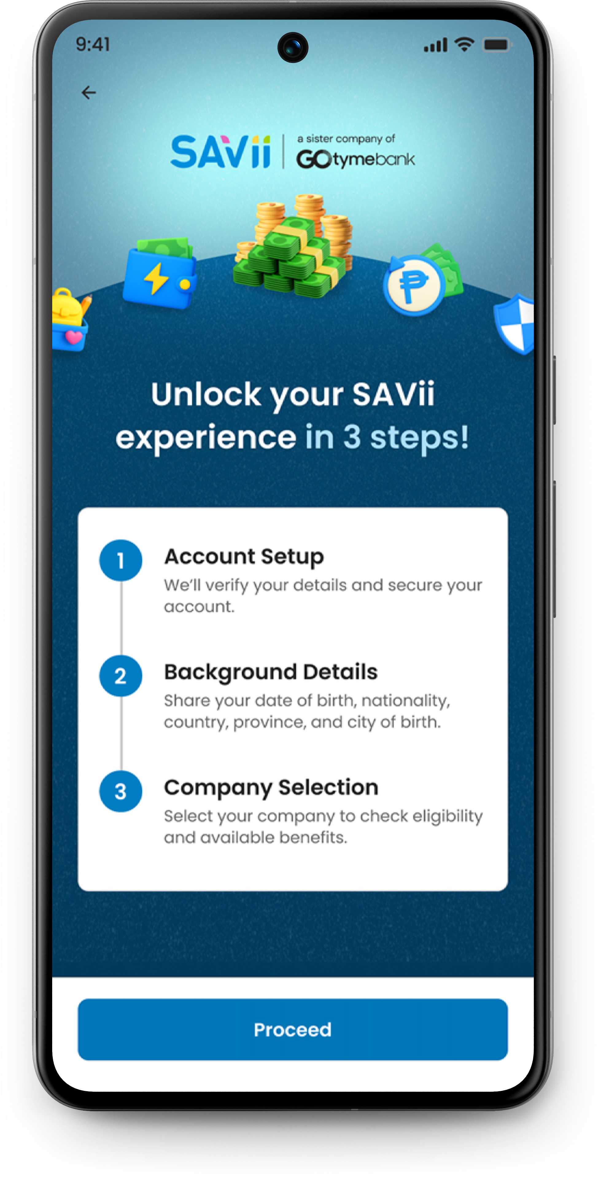
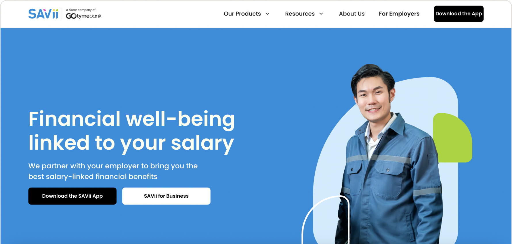
SAVii is one of the Philippines’ leading financial wellness platforms, offering salary-linked loans and other financial products to employees.
The app serves thousands of users who depend on it to access credit, manage repayments, and explore financial products — but its UI hadn’t kept up with the product’s ambitions.

THE PROBLEM
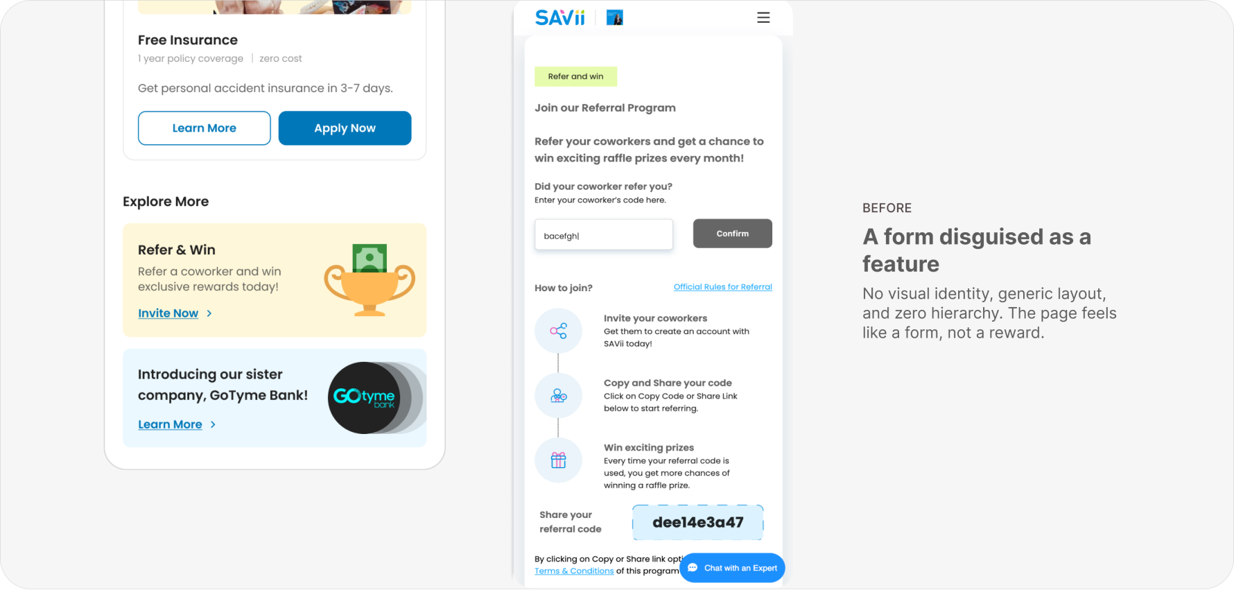
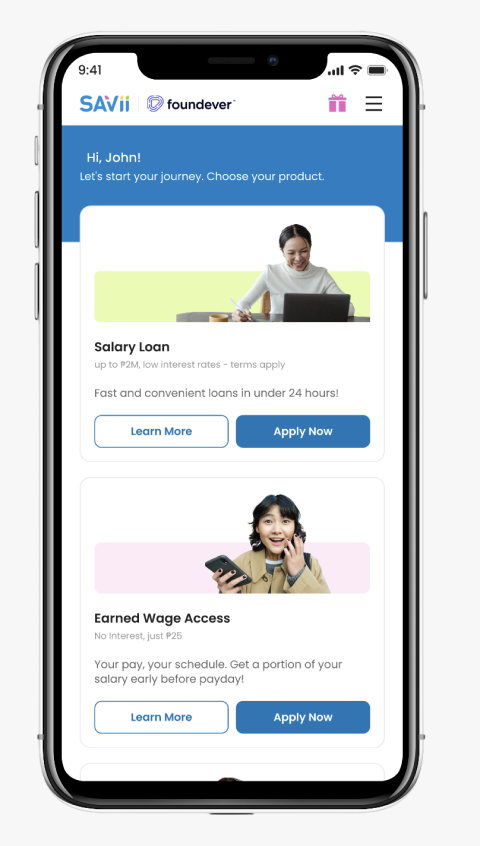
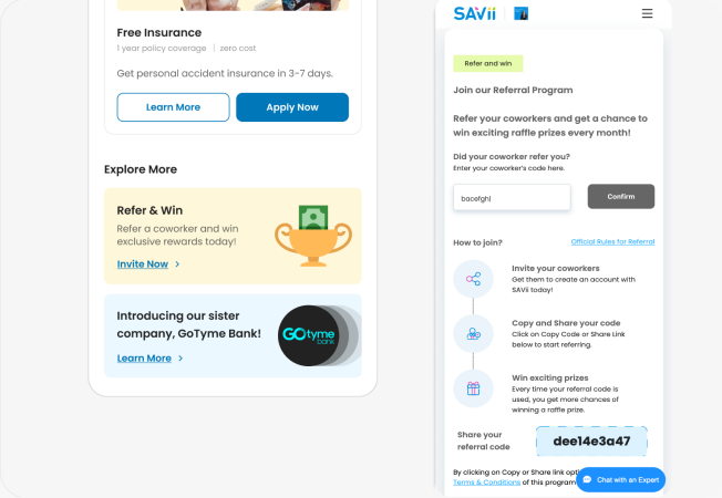
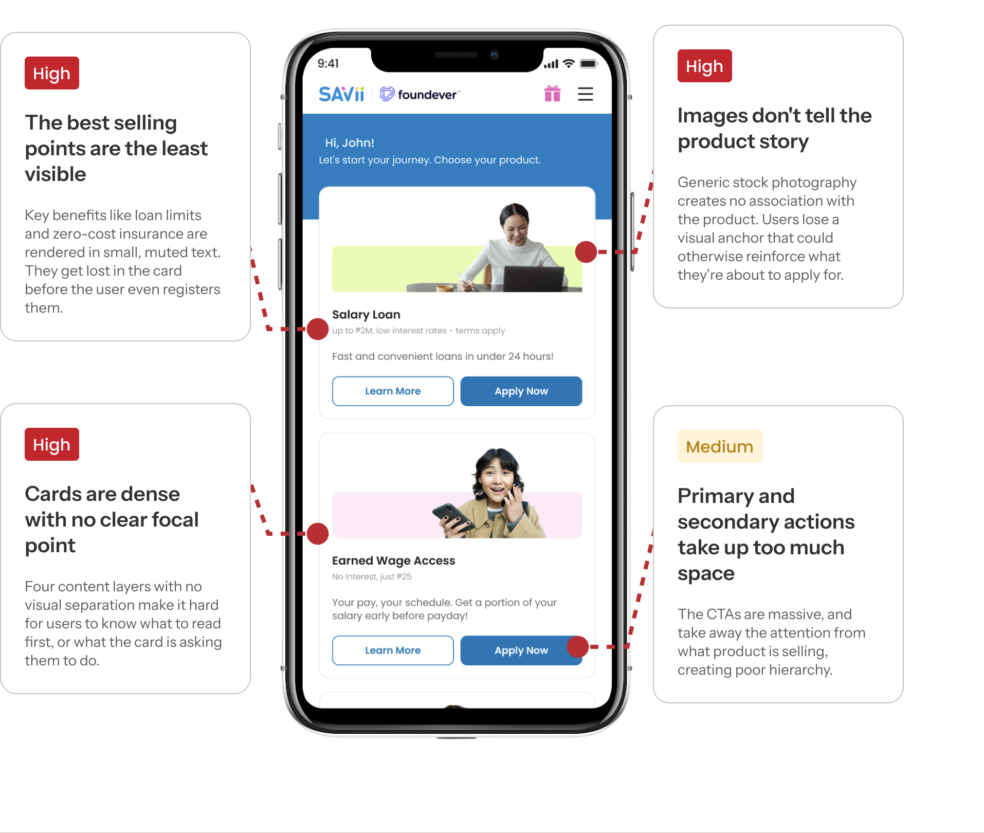
SAVii’s UI looked very outdated and lacked polish
We identified four core issues across the product cards and home screen — ranging in severity from high-priority UX failures to medium-priority visual issues.
VISUAL EXPLORATIONS
3 Directions. One brand voice.
We explored three distinct visual directions, each pushing a different interpretation of SAVii’s identity — from trustworthy and functional to bold and tech-forward.
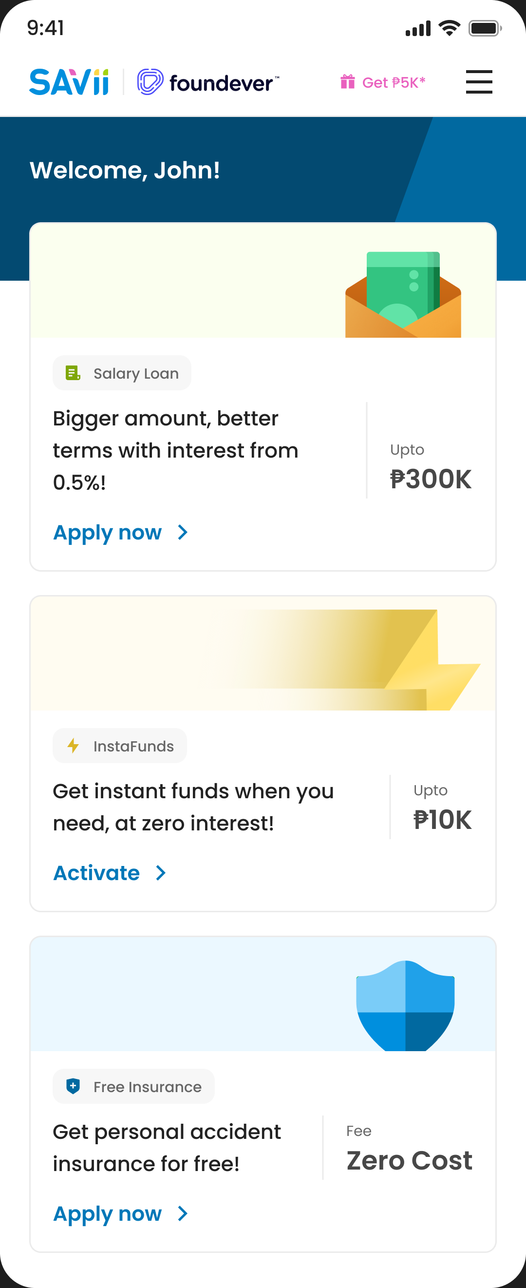
direction 01
Iconiq
The bet
Lead with USPs, not product names. A borrower cares about “interest from 0.5%” before they care about “Salary Loan.”
What worked
Spacious, clean layout. Flat illustrations that signal safety, important for a lending product. Cards felt calm and low-pressure.
The tension
SAVii worried existing users would lose recognition without prominent product names. They also insisted on retaining “Learn More” as an explicit CTA — we’d proposed removing it to reduce decision load.
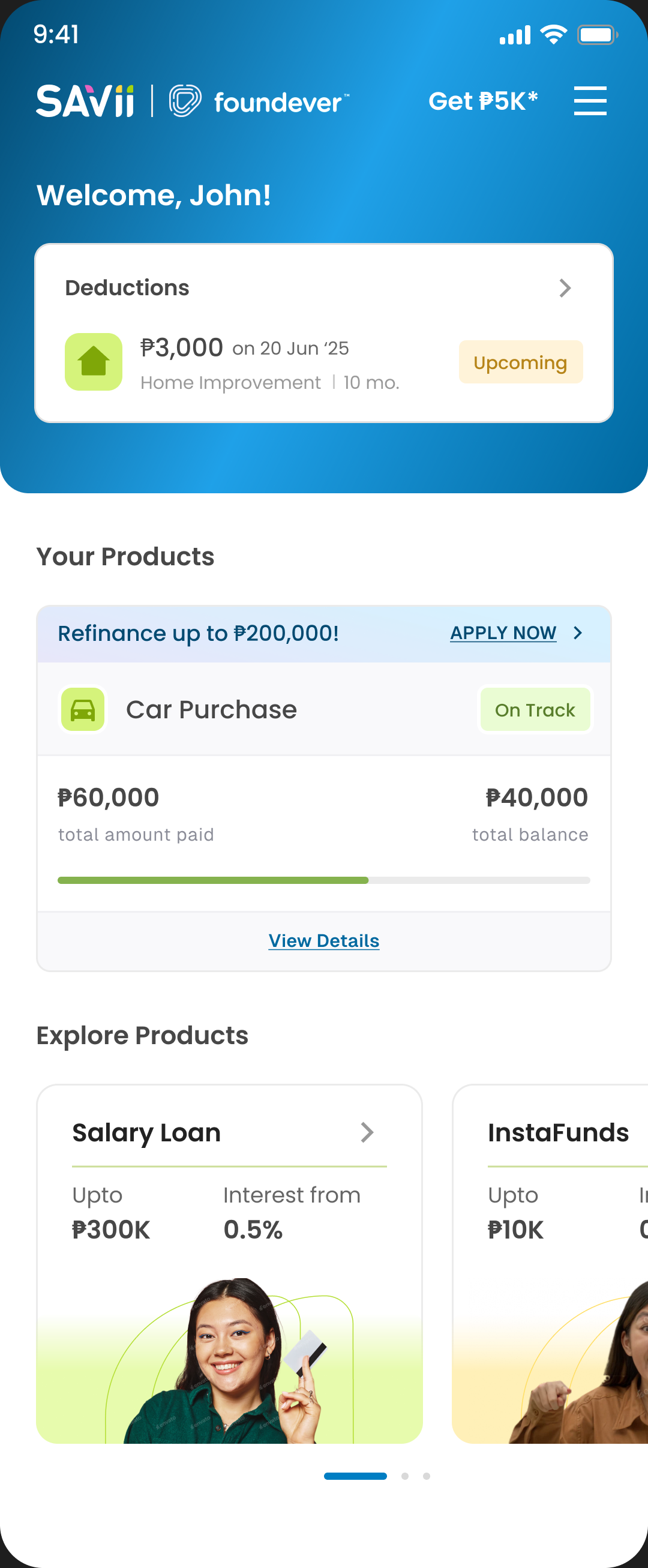
direction 02
Edgey
The bet
Rethink the entire card — no CTAs, just product name, key numbers, and a tappable surface. Zero choice paralysis.
What worked
Boldest visual direction. Simplified card structure was our strongest conviction — fewer choices, faster decisions.
The tension
SAVii was open to rethinking card content but not the broader visual system. “Too wild” for the existing app language. This drew a useful line: flexibility in what’s on the card, not in how the app looks overall.
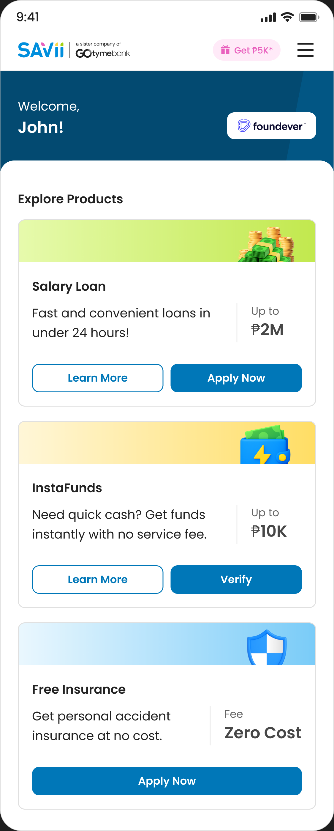
direction 03
Vivid
The bet
Give product name and USP equal weight — solve the recognition concern from Iconiq without losing the value-first approach.
What worked
3D icons and gradient headers felt premium and aligned with SAVii’s approachable brand. The balanced hierarchy landed well with the team.
The tension
We flagged dual CTAs (“Learn More” + “Apply Now”) as redundant. SAVii’s counter — repeat borrowers want a direct “Apply” shortcut without revisiting the product page. Valid, but two equally weighted buttons creates hesitation.
CHOSEN DIRECTION
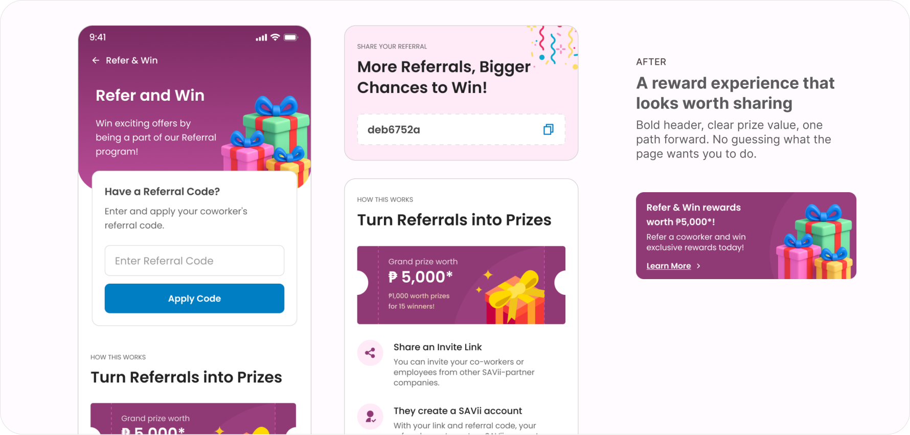
Vivid hits the sweet spot between brand and ambition.
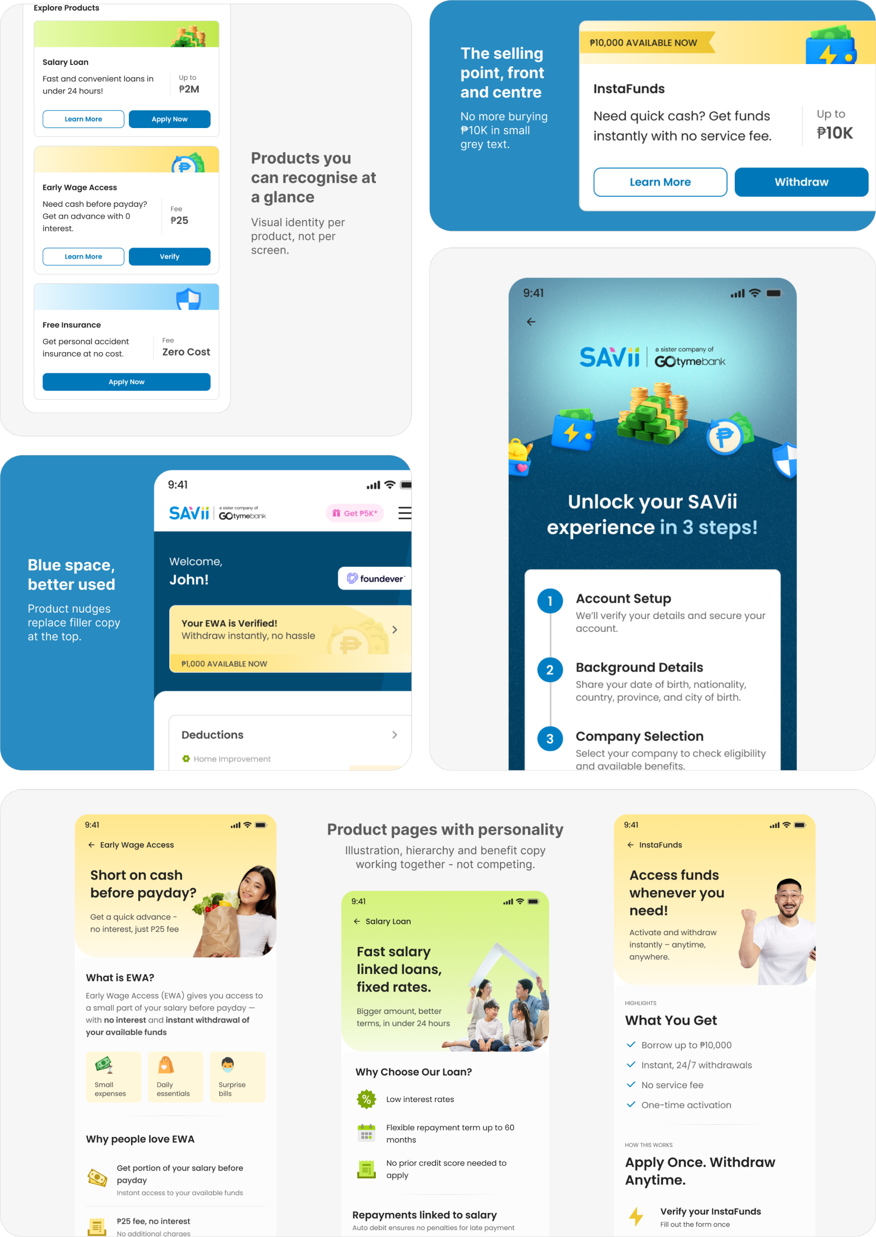
IMPACT
A visual refresh that moved the needle by 60%.
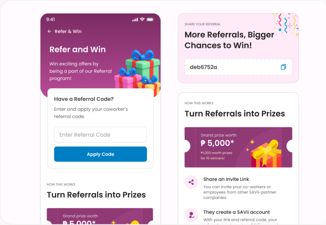
Following the redesign, SAVii saw a 60% increase in Refer and Win participation — the strongest signal that the visual refresh resonated with users.